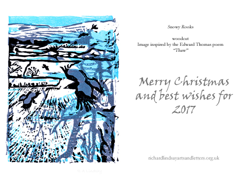
One of the most pleasing things about running a stall at the recent excellent IUCN UK Peatland Programme Annual Conference in Shrewsbury was the discovery that several fellow peatland people were also woodcut or linocut enthusiasts. I won’t name them because I don’t know whether they are ready to have their skills exposed to the public gaze but suffice it to say that some extremely enjoyable and instructive discussions took place during the coffee and lunch breaks. In discussing the various techniques which we have each explored, and given the wider interest shown in my ‘Snowy Rooks’ woodcut, it occurred to me that it might be interesting for people to see how this woodcut, with its associated printed card (both available through my Etsy store), was produced.

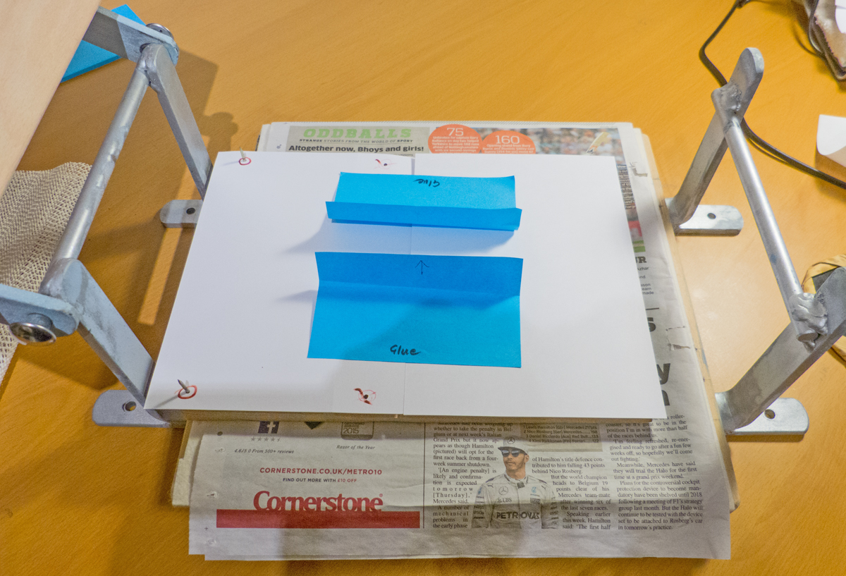
To begin with, two small holes were punched in the original drawing using the smallest setting on a leather hole punch. The drawing was then placed on a board of short-fibre MDF and the two holes in the drawing were marked onto the board. These marks were drilled using a small drill bit, then the holes in this board were used as guides to drill two holes in a second board of MDF. Small nails were then pushed through one board and the drawing was placed onto the board by slipping the holes in the drawing over the nails. After placing a sheet of carbon paper beneath the drawing, the areas of the design involving the palest blue were drawn round. The Board was then flipped over and the nails reversed. The drawing was again placed on the nails and the mid-blue colour areas were drawn round.
The nails were then transferred to the second board and the same process followed, but this time indicating the areas of grey, then the board was flipped over and finally the areas to be black were drawn around.
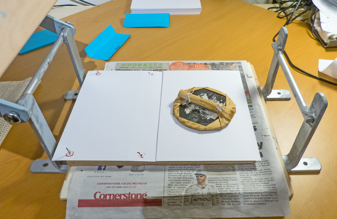
The four faces were then carved out to leave as raised surfaces only the areas relevant to that colour – although if an area is subsequently to be overprinted with a darker colour such areas do not need to be carved away because the dark ink will over-print onto the paler colour, obscuring it.

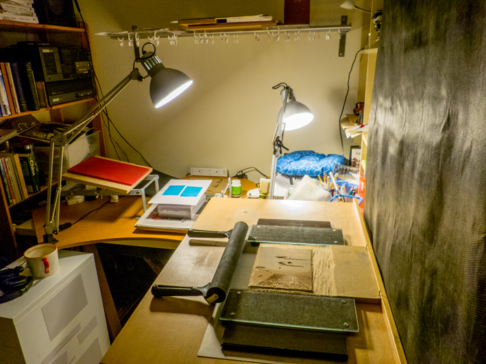
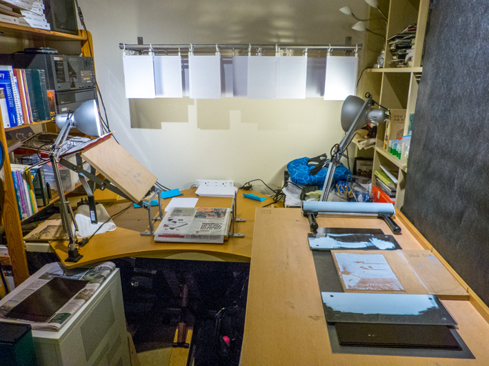
For both the proof-printing and final printing the woodblocks were positioned on a printing board and locked in place using glass plates positioned either side of the woodblock and raised to the level of the printing face using thin sheets of material – as seen here with the mid-blue block. This was to prevent the inking roller from rolling off the raised woodblock face and inking lower parts of the block.

After a certain amount of proof-printing to check that the carving was producing the correct effect, the four faces were cleaned and prepared for final printing. The palest block was positioned first as one generally prints in sequence from palest to darkest colours.
It was then inked using the palest ink.

Having inked the block, a piece of A5 card with holes punched at the same positions as the nails in the woodblocks was then aligned with the card on which the design was to be printed. The two pieces of card were locked together, matching corners, using large post-it notes (!)
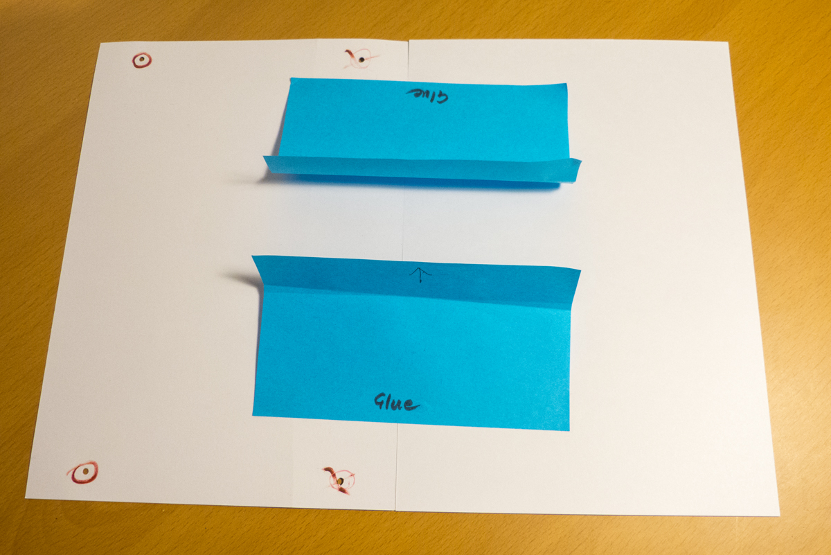
The hole-punched card and its companion card to be printed were then lifted and the hole-punched card dropped over the nails of the woodblock.
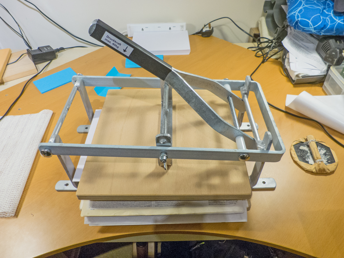
A sheet of greaseproof paper (removed here for clarity) was then placed onto the card to be printed in order to provide a slippery and protective surface to the back of the card and a ‘barren’ (traditional Japanese pad for burnishing woodblock paper onto the inked block) used to press the card against the ink, thus helping to fix it in place.
A pad was then placed on the print and the printing press closed over it to press the card to be printed firmly against the inked block.
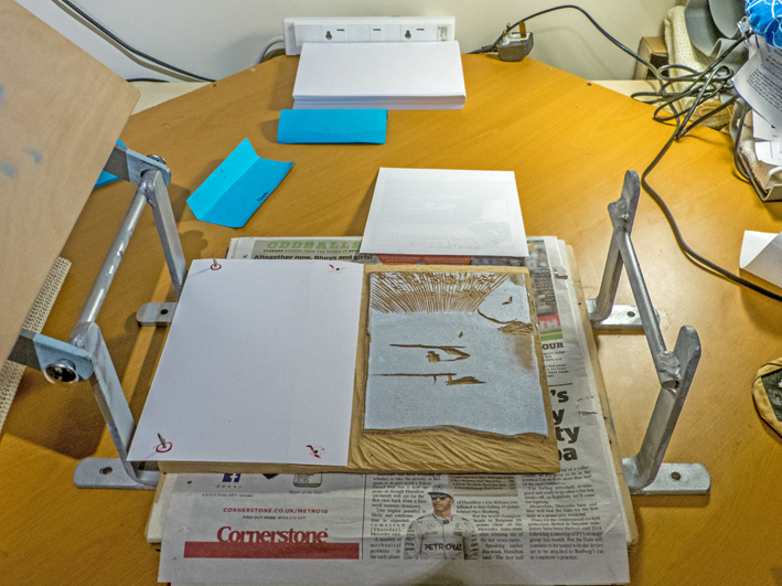
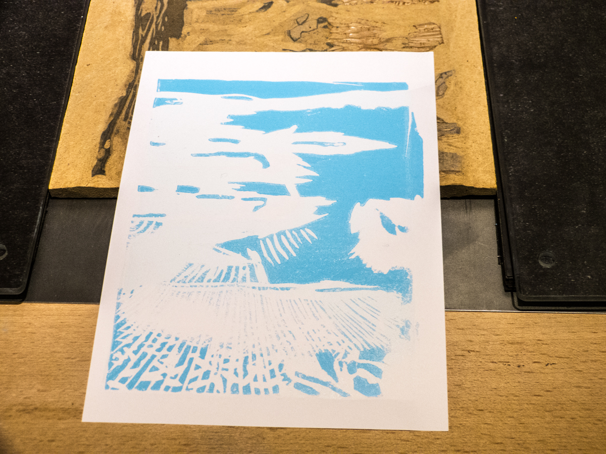
On opening up the press, the first print colour can be seen on the card.
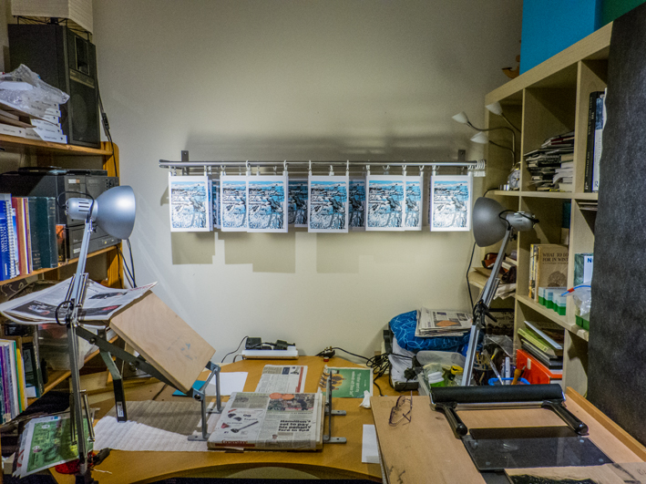
The whole print run is then completed for this palest colour and the cards hung up to dry.
The next block face is prepared and the cards printed using the next-darkest colour – namely the mid-blue – then the grey block is positioned for inking.
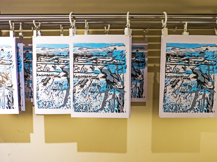
It all still looks pretty much without shape or form once the first three colours have been printed and can be rather depressing at this stage, wondering whether the whole design has failed. It is only with printing of the black that it becomes clear whether the whole exercise has been a total failure or not. That first print from the black block is nerve-racking. Fortunately the ‘Snowy Rooks’ emerged looking more-or-less as I’d hoped. It’s always possible to spot potential improvements, but overall the relief that it had largely succeeded was enormous and merited a glass of wine – after I’d printed all 30 sheets and hung them up to dry…
Interestingly when the cards were transferred digitally to Spingold Design and Print – my local friendly commercial printers – for conversion to greetings cards, the colours developed a subtle purple tinge which I rather like, so I think if I run off any more prints I’ll need to mix a little magenta with the cyan to create this overall tint. That said, I really need to be working on my design for the sundew linocut which is currently rattling around inside my head…